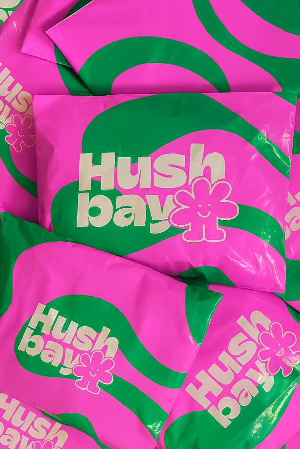
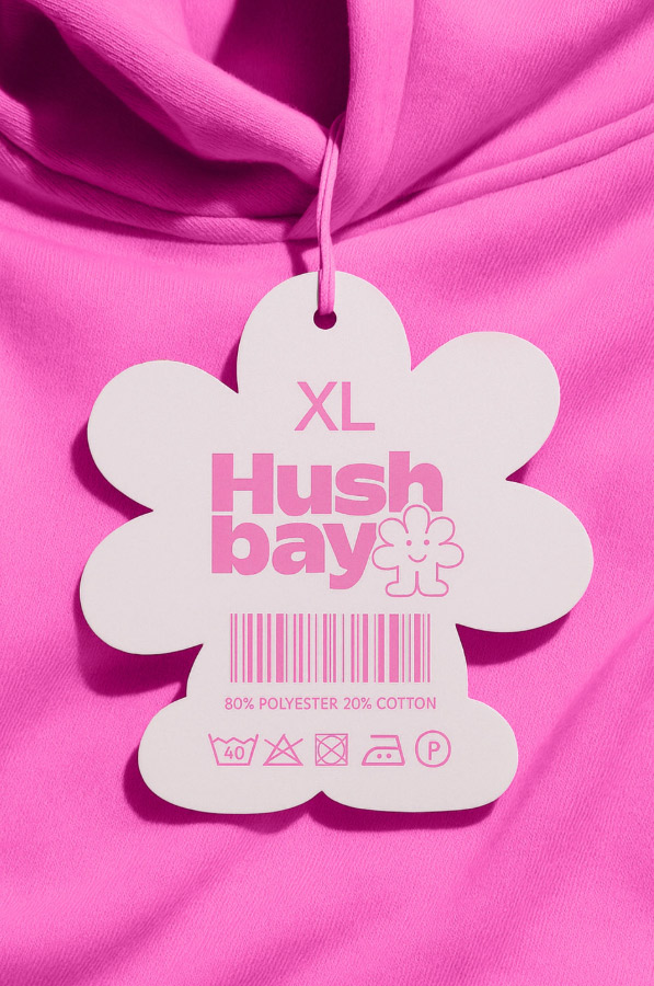
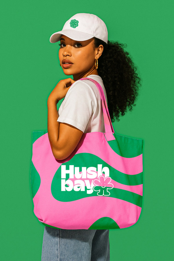
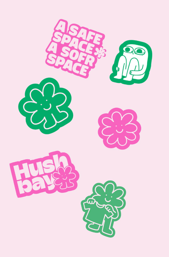
I crafted a brand identity born from a deeply personal story—a quiet rebellion against loud trends and identities that don’t feel real.
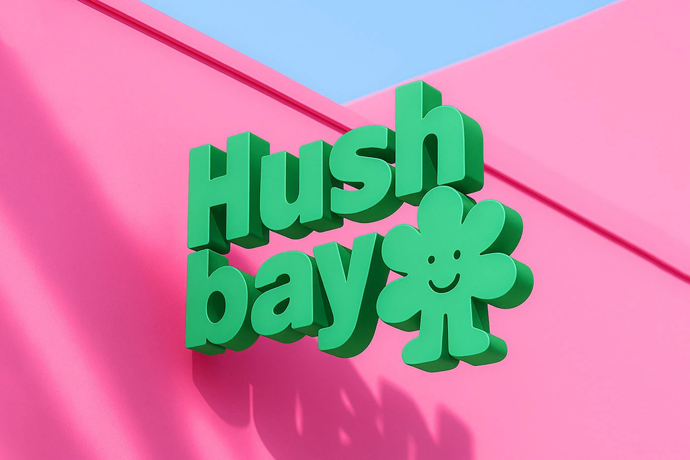
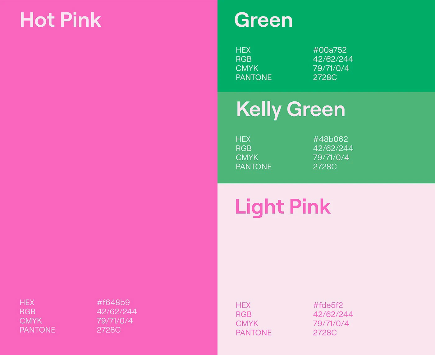
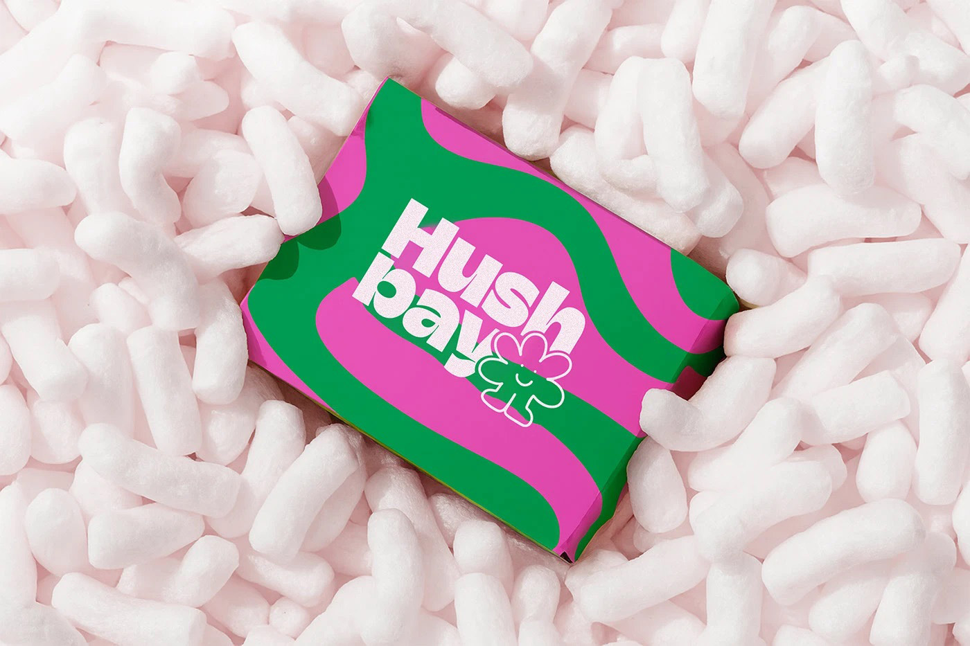
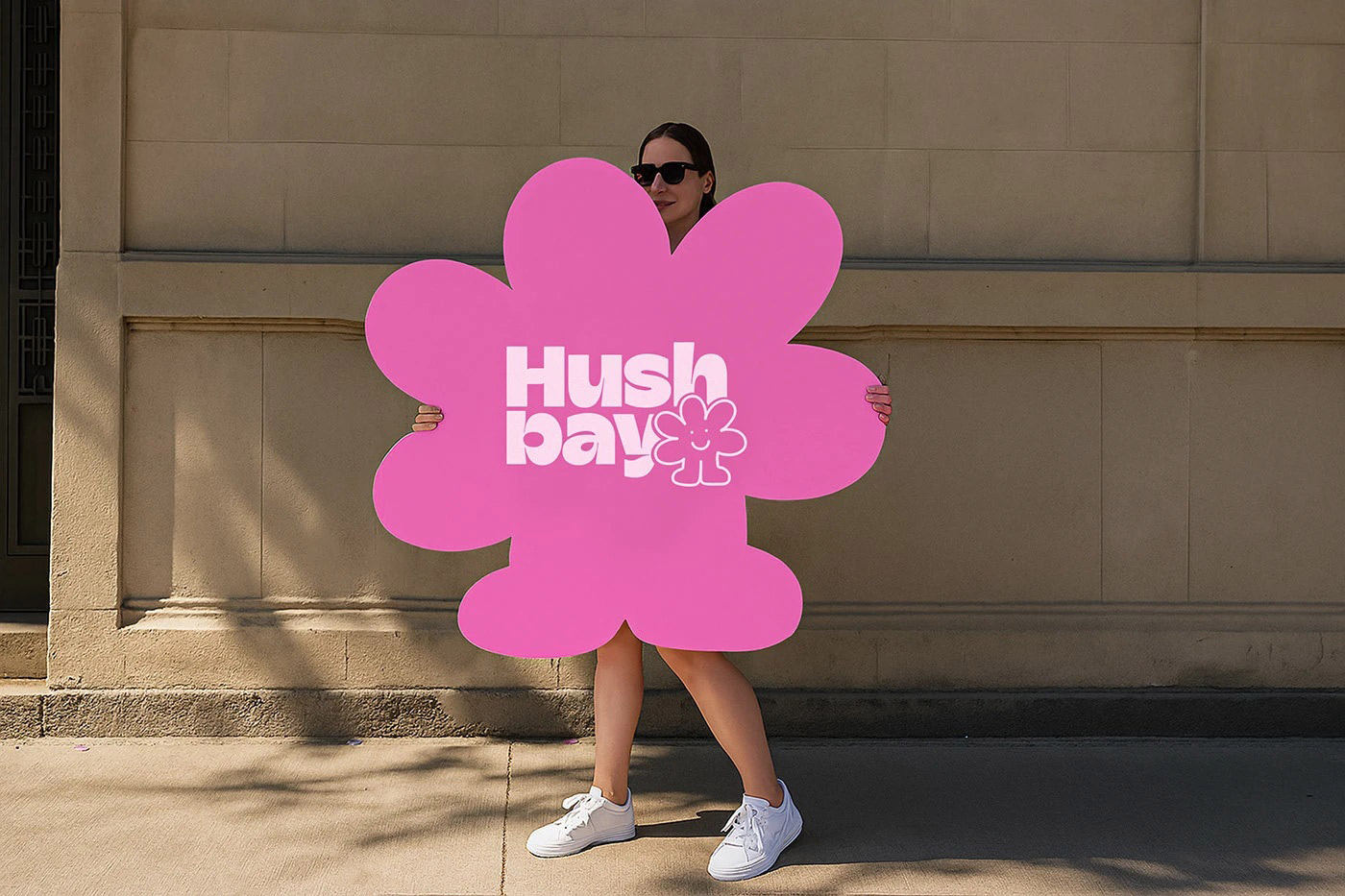
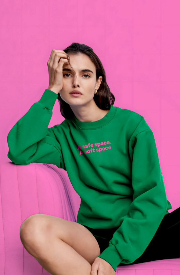
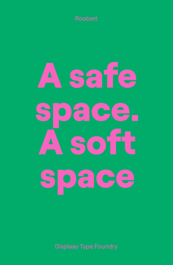
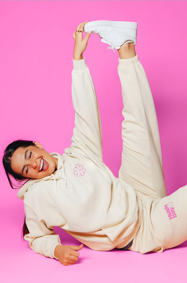
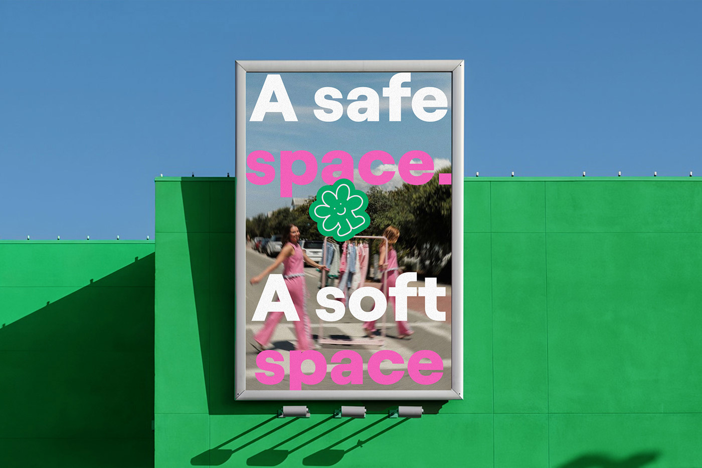
The challenge was to create visuals that feel soft yet strong, expressive without shouting, and deeply personal without losing clarity. The logo reflects this spirit: rounded chunky typography for comfort and confidence, paired with a playful flower character that brings warmth, friendliness, and nostalgic joy. The bright pink palette embraces unapologetic femininity, while the rounded forms embody softness and self-assurance. Every detail was designed to honor women who are powerful in quiet ways.
The result is a brand that doesn’t scream for attention, but softly commands presence—a hug in visual form, celebrating women who own their voice, even in a whisper.