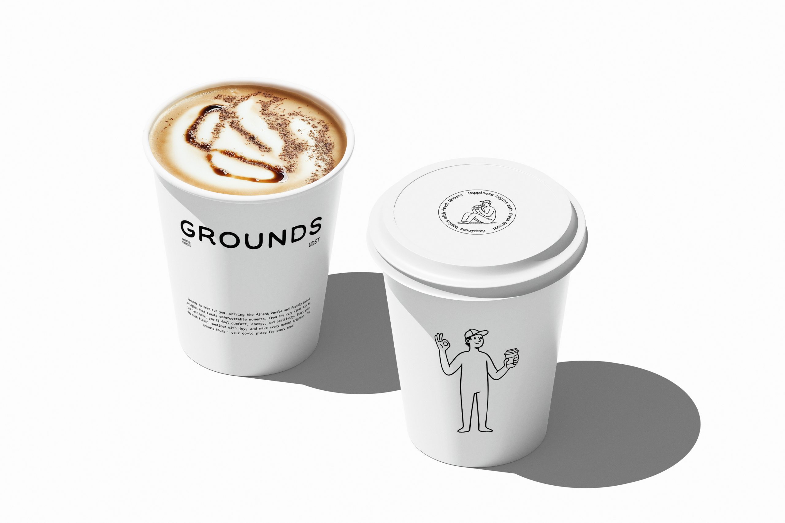
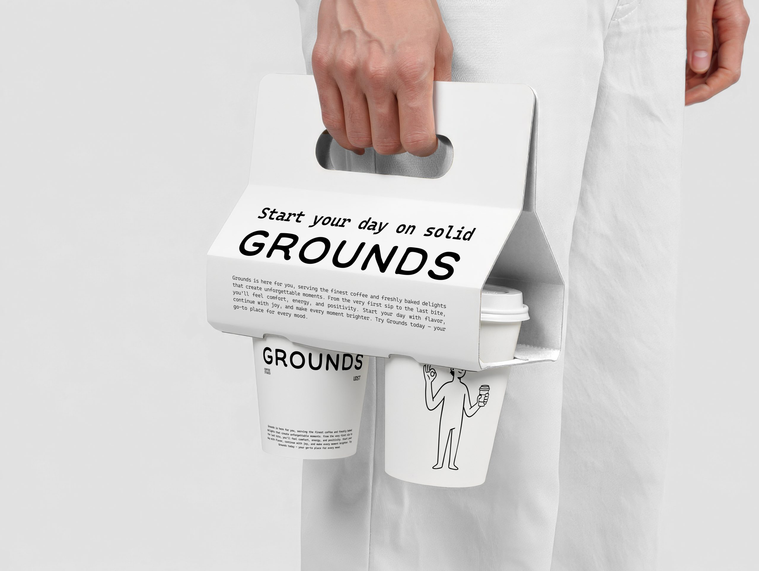
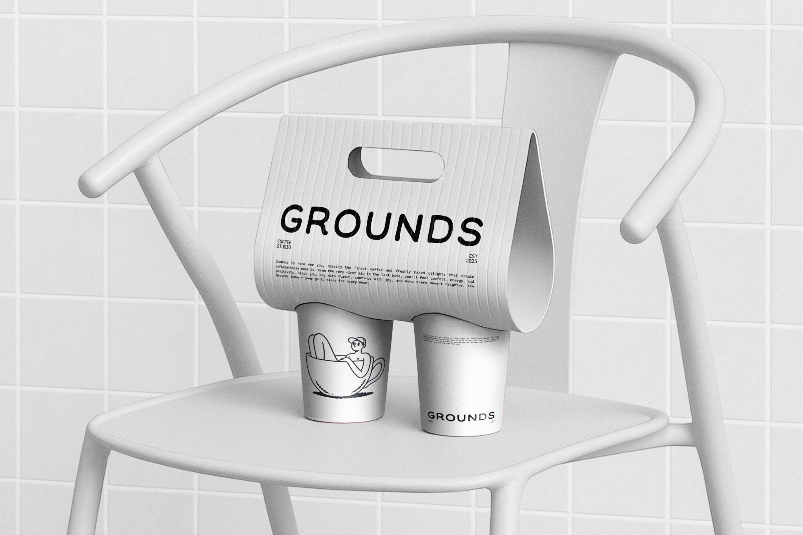
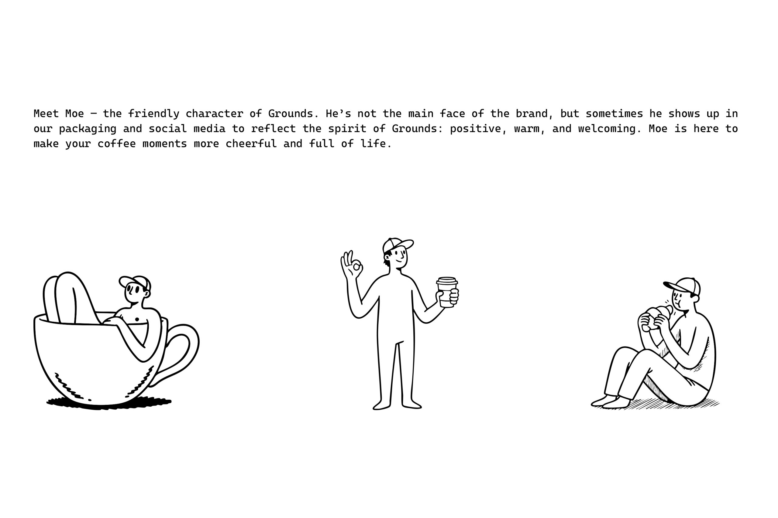
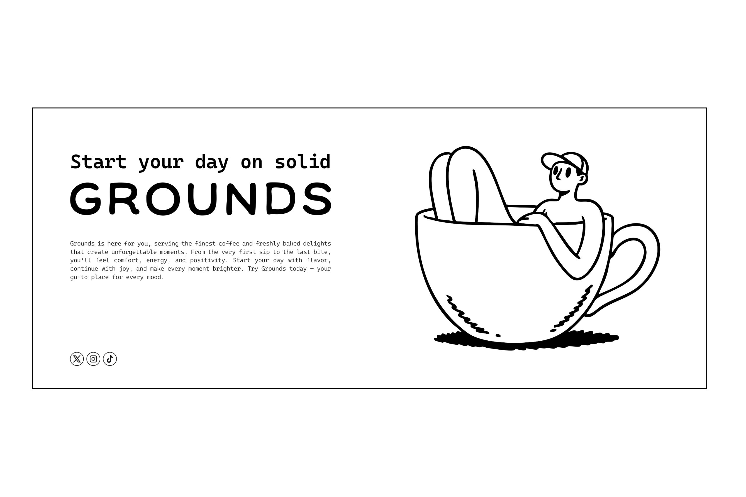
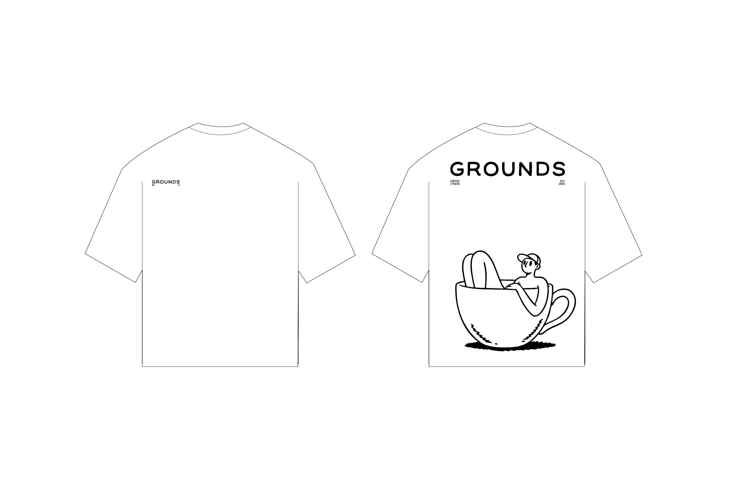
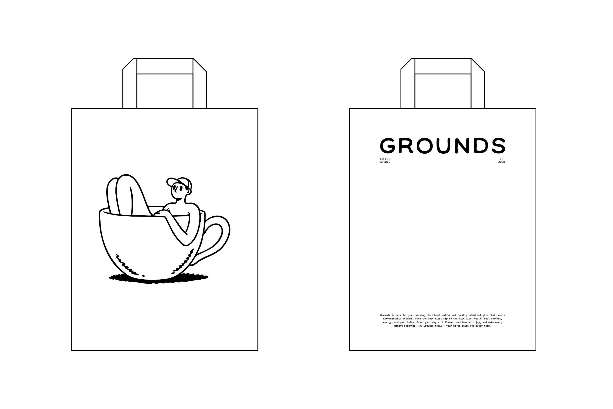
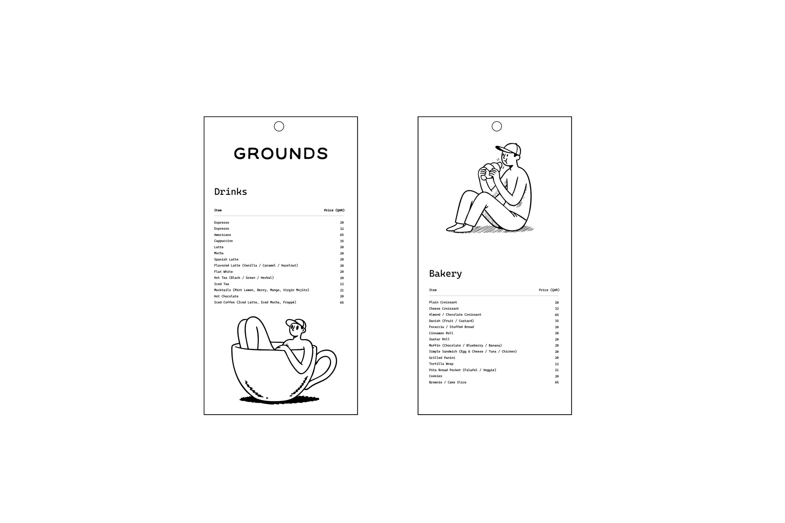
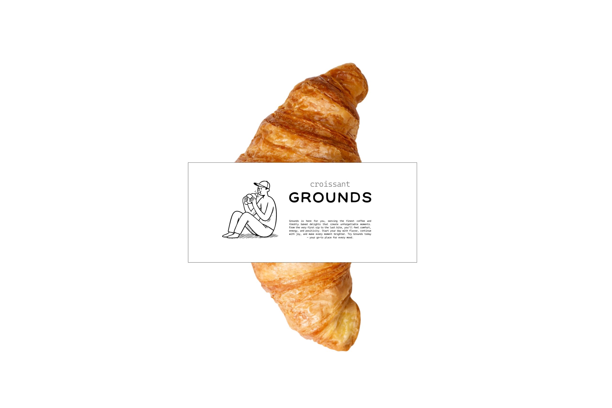
Grounds was built to solve a key challenge: most campus cafés tend to be visually loud and overly colorful, making it hard to stand out. Our approach was to strip everything back to black and white minimalism, creating a clean yet bold identity that instantly feels modern and memorable. To avoid the risk of looking too rigid, we introduced Moe, a friendly illustrated character that occasionally appears across packaging and social media to bring warmth, humor, and relatability. The typographic system, inspired by monospaced type and editorial layouts, reinforces a cool, effortless vibe that resonates with university students. This balance of minimal design with playful storytelling ensures that Grounds feels both elevated and approachable, giving the brand a distinctive edge in the campus environment.